

Before we dive into ecommerce landing pages in more detail, I would like us to do a brief experiment.
I’d like you to try and think about all the websites you’ve seen today. Or in the past seven days. How many newsletters did you receive? How many did you open, and how many did you click on?
Can’t remember them all?
Given the sheer volume of pages we are all exposed to every day, it’s no wonder we can only remember a tiny percent of them. This fact should drive my point home nicely – if you want your landing page to stand out and be memorable, you need to make it, well – what is it that you need to do?
Let’s explore!
Divulge the benefits
As ecommerce pages are clearly meant to convince a visitor to make a purchase, finding the right balance between sales and value can sometimes be a bit of a nightmare.
Let’s look at this page by Herbal Dynamics Beauty:
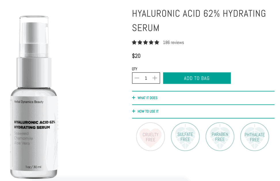
Source: herbaldynamicsbeauty.com
The hero part of the page clearly lists the most important feature: that the product is free of all sorts of harmful materials. Then, when you scroll just a bit down, you are greeted with a whole lot of information about the benefits of each ingredient, and the page ends by going into even more detail, explaining what you, as a consumer might get by choosing this product.
Customers don’t want to feel like they are being sold a product – they want to be offered a solution. By explaining the benefits and actual value of a product, you will be doing a great job at just that.
The power of design
Your pages need to be easy on the eyes and structured in a way that not only attracts attention, but is also very clear about what is what.
Here is an example by Ultimate Meal Plans:

Souce: ultimatemealplans.com
While their landing pages stick to the minimalistic use of plenty of white space, they have also integrated plenty of imagery, along with all kinds of informational boxes that detail things like pricing and benefits.
And while they were at it, they’ve managed to stick to a clever color story, too. The fact that they have also made green their main pop of color is evocative of the actual product, providing a clear association between it and the page.
No matter how good your product or message is, if your page is cluttered and hard to navigate, you won’t be making all that many conversions.
The power of a story
Storytelling is an incredibly powerful tool you should be reaching for when writing copy for your landing pages.
Let’s take a look at the landing page of an actual story, Danielle, a novel by Ray Kurzweil.
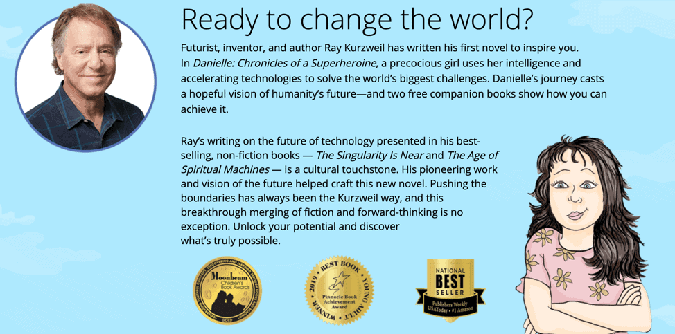
Source: danielleworld.com
The hero is catchy, gives you plenty of information without actually giving anything away, and the rest of the page provides all you need to know: enough to get you interested. This kind of hook is not reserved for literary ecommerce pages alone – you can tell a story about your product regardless of what it is.
Make sure you take your target audience and their preferences into account when writing out your story. And write for them, not for yourself.
Provide plenty of detail
Home pages can be hard to design. Not only are they often the first thing people see, but they also need to provide plenty of information, yet not overlap too much with other pages.
Pergola Kits USA have done a good job here:
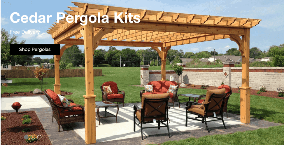
Source: pergolakitsusa.com
Their hero showcases the product they sell and will instantly draw the attention of those looking to buy a pergola. Scrolling further down, a visitor can find all the information they need in one place, without having to navigate between several different pages.
This is an all-in-one page that is easy to read, provides enough imagery to keep you interested, and provides real value. You won’t need to read another one to understand what kind of product you need for yourself.
Sometimes it’s best to give your visitors what they are looking for in one place – and make sure they have clearly got the message you’re trying to convey.
Social and other proof and why it matters
People like to be a part of a group, and they like to explore products others have tested and approved. That’s why you’ll want to display all the proof you can find: social proof in the form of testimonials, big companies you have worked with, as well as award buttons, and any other achievements you may have under your belt.
Real Thread does that right in the middle of their homepage:
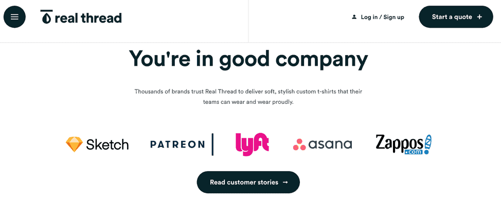
Source: realthread.com
They have incorporated a section that includes some of the major companies they have worked with. This instantly gives their product a boost and makes them stand out. Even though you may not have heard of the brand, you might be more tempted to give their shirts a try, now that you know which other companies they have worked with.
Be careful what kinds of awards and badges you list, though. Too many of them can cause an adverse effect, leading people to perceive you as bragging or to wonder what you’re trying to hide by listing all of these positive reviews so prominently.
The power of the hero
Your hero image is incredibly important. It should explain in one glance what the product is about, yet do it in a way that’s not boring or too showy.
The Farmer’s Dog does a good job with this image:
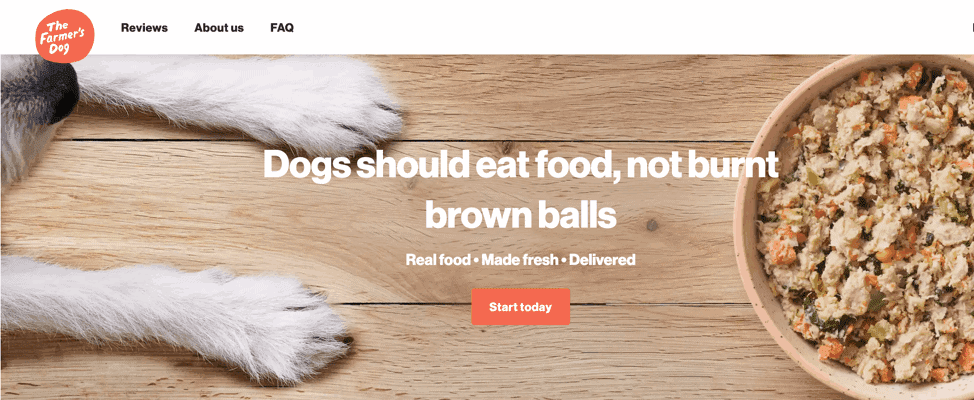
Source: thefarmersdog.com
It shows the product, as well as a satisfied customer enjoying it, and you’ll understand right away what the food they’re selling looks like and whether it might be something that your pet would enjoy.
The image is of a high quality, but more importantly, it is also optimized well, so as not to slow the page down and take up unnecessary space – a very important feature to bear in mind when thinking about the imagery you want to use.
When choosing your hero, make sure it is not only an accurate representation of your product, but also catchy and unique.
Final thoughts
When designing a landing page, make sure you have your target audience in mind, and stay in line with the product the page is trying to sell. Add to that a bit of creativity, and you should have a standout page on your hands.