Your website is like your office and retail store. When visitors enter, you want them to be impressed with what they see. You want them to be entertained by the facilities. You want them to find what they’re looking for, and they’ll be compelled to purchase.
Animation is a web design tool that can do all three: impress, entertain, and locate.
It can also distract and annoy site users and slow webpage loading times.
Should you use animation on your website?
The answer will depend on its purpose and how the website will use animation.
Keep reading if you’ve been considering using animation on your website or are skeptical about its benefits.
What Is Animation in Website Design?
When people hear “animation,” they think of a Mickey Mouse-type animated character appearing on screen.
In website design, animation, as a design tool, covers a broader scope than using animated characters.
Animation is a movement that occurs after a web page has loaded.
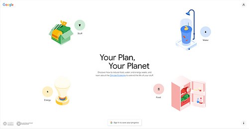
Check out Google’s Google Your Plan Your Planet website.
Once you land on the home page, Google’s Unique Value Proposition (UVP), “Small Changes Can Make a Big Impact on our Planet,” comes together.
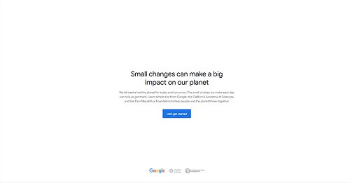
(Google Your Plan Your Planet)
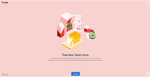
Click the CTA, “Let’s Get Started,” and the page morphs with colorful and charming animated graphics representing “Water,” “Energy,” “Stuff,” and “Food” appear.
(Google Your Plan Your Planet)
Hover your mouse on the graphic, and the arrow transforms into the popular “pointing finger” icon, indicating that you’ll be taken to another web page if you click on it.
(Google Your Plan Your Planet)
Try it!
- Did the experience entertain you?
- Did animation make it easier to understand what the website’s about?
- Did the experience make you want to explore the website further?
- Did the experience give you a positive impression of Google?
- Did the animation make you agree with Google’s perspective about the environment?
If you answered “Yes” to most of the questions, you should consider animation for your website!
What Are the Pros and Cons of Animation?
Let’s find out the pros and cons of animation to help you make the best decision for your website.
1. The Pros of Animation For Your Website
- Create a dynamic, vibrant, and entertaining User Experience (UX).
- Improve functionality and navigability.
- Highlight innovation and creative design.
- Trigger the desired emotional responses.
- Enhance engagement.
- It is easier to understand the UVP and message of your content.
- Create a strong first impression.
- Improve conversion rate.
2. The Cons of Animation For Your Website
- Slow down website speed.
- Distract the audience.
- Detract from the message of your content.
- Some users might view them as inappropriate or irrelevant.
- Some users might be annoyed by the animation.
The pros outnumber the cons!
Does this mean you should use animation on your website?
No.
Although the pros of using animation for your website outnumber the cons, you have to study the decision carefully.
Remember, animation is a web design tool. If used improperly, animation can hinder the growth of your website.
9 Types of Website Animation
There are many ways animation can be applied to website design. Here are nine of them.
1. Hover Animation
The most common type of animation found on websites. Hover the mouse over a clickable graphic, such as a button, and it either enlarges or changes color.
You’ve come across websites that use hover animation. You might not have thought about it then, but hover animation made the website more engaging, helpful, and entertaining.
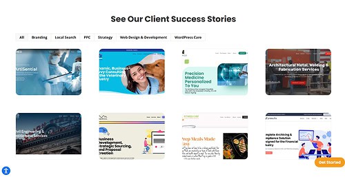
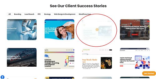
An example is our Portfolio page.
You’ll see our portfolio of website design clients. If you want to see what a client’s website looks like, hover your mouse over the thumbnail.
The image will get blurred, and you’ll see the “+” symbol. Once you click on the image, you’ll be taken to our client’s website.
Hover animation will guide your site users. They’ll know which buttons, graphics, or text to click to go to another page.
2. Loading/Website Progression
Website users aren’t patient. Once they click on your URL, they expect to land on your page in three seconds or less.
Occasionally, you’ll have pages that are slow to load. Use animation to make the page loading time more pleasant.
An example would be an animated hourglass just turned over, and sand slowly fills the bottom half.
You can add an animated text that reads:
- “Trust us, we’re worth the wait!”
- “Thank you for waiting 🙂”
- “Heavy traffic, sorry!”
You can also share some trivia about your business, products, and services.
3. Micro-interactions
Whenever you successfully upload a post on Facebook, you’ll see the animated “thumbs up” graphic pop up. If you type in the wrong password, the field starts shaking.
Animation is an effective way of engaging with site users. It can be used to inform or entertain to elicit a specific emotion.
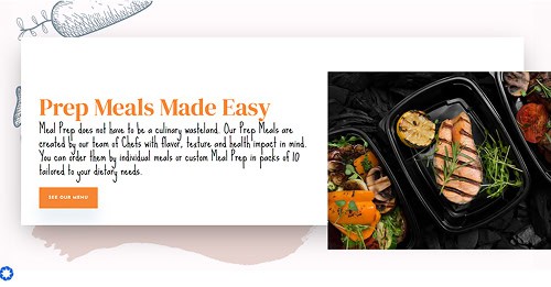
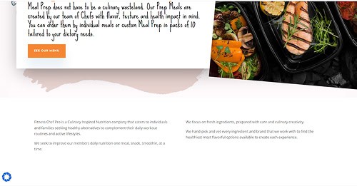
For the website we designed for Fitness Chef Pro, we took a subtle approach to adding animation on the home page.
Scroll down the page, and the image of the salmon meal tilts to the right. It gives you the look and feel of menus and food pictures often attached to the refrigerator door with magnets.
It’s a fun and creative way to inform site users whether they receive the service they paid for from their carrier.

4. Website Navigation
Some users will struggle to figure out your web page. Animation can help them navigate your website. Directional arrows can guide users where to hover their mouse.
- The directional arrow on the top page will reveal the drop-down menu.
- The directional arrow on the right page will pull out the list of products and services or the sidebar with the social media links.
- The directional arrow at the bottom of the page will guide the user to scroll down for more information.
Animation can give you a cleaner and more organized web page without compromising functionality.
5. Carousel/Slideshow
In web design, carousels and slideshows are used to emphasize specific information about the business.
For example, you can present the following information in a slideshow:
- Customer testimonials.
- Product reviews.
- Products and services.
- Awards and achievements.
- List of users/customers.
You can hide the slideshow and have it accessible with a directional arrow. Adding animation techniques such as vanishing, sliding motion, or a zoom feature can enhance the content when the slideshow appears.
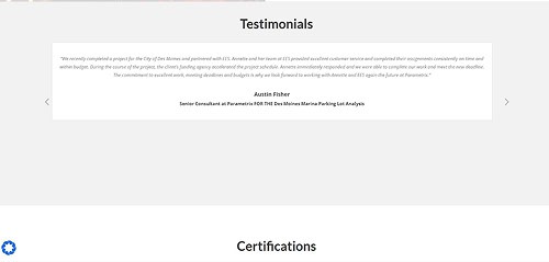
A good example is the slideshow animation we did for our client, Entitlement and Engineering Solutions (EES).
Scroll down the home page of the website, and you’ll see the testimonials of EES’ clients presented as an animated slideshow.
There are directional arrows on both sides of the slide in case you want to go back to specific testimonials.
We placed the slideshow animation at the bottom to keep it from distracting users from the key points of the home page.
6. Pop-Up Animation
Pop-ups are graphics that overlay a webpage. Usually, the pop-up comes out when you’re scrolling or about to leave the page.
It can be annoying, but a well-designed animated pop-up can make it entertaining and useful.
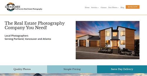
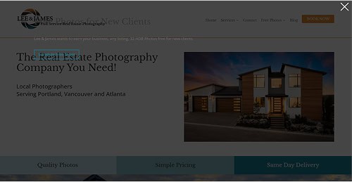
We added a pop-up on the home page of our client, Lee & James Full Service Real Estate Photography.
As your cursor moves out of the home page, a pop-up that functions as a CTA will appear.
The CTA asks you to Schedule a Free Shoot with Lee & James.
As you can see, we used a dark background to keep the pop-up simple and to highlight the CTA, which is presented in powder-blue font.
We don’t want to annoy site users with a flashing pop-up with bold colors and font styles.
7. Full-screen Animation
Full-screen animation can create an engaging and immersive user experience. It’s commonly used to introduce the business to users or to guide them through various processes.
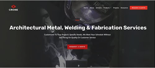
We used full-screen animation for our client’s home page, Crone Metals.
Against the backdrop of the description of services and UVP, we take users through an animated tour of the Crone workplace and their projects.
8. Parallax Animation
Parallax animation or parallax scrolling is a technique where moving graphics are incorporated in the foreground or background of the page. It creates a dynamic and enchanting 3D effect.
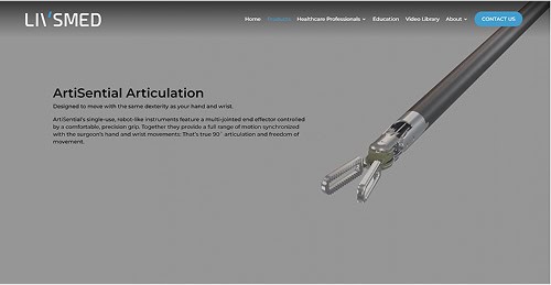
A good example of parallax animation at work is the website we designed for the products page of LIVSMED US.
In the background of the page, you’ll see a variety of ArtiSential’s robot-like instruments at work and highlight how the movements simulate those of a surgeon’s hands.
9. Interactive Forms Animation
Contact forms are essential in websites. They’re a convenient way for site users to communicate customer service issues, sign up for newsletter subscriptions, or create online profiles.
Animation is an effective tool for guiding users through filling out form fields.
A good example is when the user is asked to create a password.
While typing the password, below the field, you can see animated text informing the user if the password is strong or weak.
There are contact forms where the fields run examples of the required information when the user hovers over it.
For example, when the user hovers the cursor over “Birth Date,” the field runs animated text, “12 June 1995.” This tells the user to type in the date before the month and the birth year.
5 Tips On How To Use Animation On Your Website
Here are five tips on how to get the most out of animation on your website.
1. Prioritize Functionality
The animation must improve functionality and not hinder the performance of your website. They must help users navigate your website, fill out forms, and find information.
Animation must not slow your web page’s loading time or annoy the user. Animation mustn’t affect responsiveness since nearly 60% of online traffic comes from mobile devices.
2. Focus on Intuitiveness
When you’re about to checkout at the supermarket, the overhead signs in the cashiering area should accurately explain where to line up for cash payment, card payment, senior citizens, or if you’re buying fewer than 10 items.
There shouldn’t be second-guessing.
The same goes for animation.
Animation is supposed to make it easier for visitors to use your website. It should guide them on using your website.
- How to find the dropdown menus.
- How to fill out the contact forms.
- How to sign up for subscriptions.
- How to set up an online profile.
- Where and how to pay.
- How the processes work.
Remember, if used properly, animation can greatly improve User Experience (UX).
3. Animation Must be Purposeful and Relevant
Animation must serve a purpose, and its design must be relevant.
Go back to the Mamoria Basetis animation.
The website designer created unique and comical characters that might be the company’s mascots.
While entertaining, the animated characters serve a purpose of guiding users on the website and explaining processes. There must be a reason why animation is on the page.
If you came up with a great animated character but can’t find a good reason to put it on your website, shelve the idea in the meantime.
4. Focus on Quality
Using excessive animation will slow down your website and distract users. You don’t need a lot of animation to get results for your website.
Focus on quality and use animation only when needed.
Animation is intended to enhance, not compromise, performance and UX.
5. Get Feedback Before Implementing Animation
Good reasons for contracting the services of a web design agency are that we follow sound Quality Assurance practices and have the facilities to properly iterate and test features, including animation.
We test each iteration for mobile responsiveness, browser adaptability, and user feedback. We’ll constantly refine and improve the animation based on collected data.
Conclusion
The website isn’t just a technological innovation that allows businesses to capitalize on online opportunities. It’s a creative expression that helps build brand identity and reputation.
Animation can turn a drab, cold, static website into a dynamic, thriving, engaging platform that wows audiences.
However, animation shouldn’t draw unnecessary attention to itself. Instead, it should complement the overall design and functionality of your website.
If you review our portfolio, not all of our clients’ websites incorporate animation. We used animation only when necessary.
Animation is a wonderful tool that can enhance User Experience, but it has to be used with thought and purpose.
Does your business have a website? Do you think your current website needs an upgrade or animation? Contact us, and let’s get started!

