After finalizing its trade name and having the enterprise registered, the next order of business is designing its logo. This is an important component of your branding strategy. A good logo is more than just a symbol. Properly designed, it will create immediate brand recall and lend valuable support to your messaging.
Why Your Business Needs Good Logo Design
The swoosh. The partially eaten apple. The golden arches. It won’t take long for you or anybody to know these descriptions refer to the logos of Nike, Apple, and McDonald’s respectively.
A study by branding consultant and design firm Siegel+Gate showed that Nike, Apple, and McDonald’s have some of the memorable logo designs of all time. Others in the list included Amazon, Coca Cola, Google, Target, and Starbucks.
It’s hard to disagree with the findings of the study. The mere mention of these companies’ names create brand imagery in our minds.
And there lies the power of a well- designed logo. It identifies your brand and drives your message forward. When consumers see your logo, they begin to identify key business attributes such as quality, honesty, integrity, and consistency with your brand.
A well-designed logo is evergreen; it’s value grows as your business continues to flourish. In many cases, a logo has become a shield against controversy and bad publicity.
Nike has had its share of controversy over the years. It has been labeled a proprietor of child-labor. Throughout the period that Nike addressed these allegations, the brand remained resilient.
The “Swoosh” logo with the tagline “Just Do It” continues to inspire and motivate customers who want to perform better or improve their health and fitness.
McDonald’s has long been accused as a purveyor of global obesity. Yet, the brand remains strong. Most people who come across the golden arches logo will not hesitate to stop by for a quick meal despite all the bad publicity concerning McDonald’s food.
To be clear, a logo by itself does not make your brand. It should be part of your branding strategy. Its purpose is to encapsulate your value proposition which is answerable by the following questions:
- What is my business?
- What can we do for you?
- Why should you choose us?
In marketing, messaging is everything. All of the component parts of a marketing campaign must be aligned and convey the same message. It starts with your logo and cascades down to your content and collaterals.
Whether your branding strategy works or not will likewise depend on your business performance. If you deliver the results that were promised by your message, then your efforts will serve to reinforce your brand. The logo will gain value and prominence.
However, if you fail to deliver results, then your brand will suffer. The logo will lose value. No matter how well-designed the logo was, it will be associated with undesired attributes.
That is why designing a logo is an investment. It keeps you honest and motivated to drive your business toward success. This way, your investment in logo design will grow and reap the benefits of brand recall, resiliency, and enhanced value proposition.
Thus, the road to long-term growth and sustainable success starts with designing a good logo for your business.
How To Design An Effective Logo For Your Business
1. Subliminal Messaging – Wendy’s, FedEx, Amazon
Subliminal messaging is a powerful technique whereby the component parts of the design are able to successfully convey the branded value proposition of the business.
There is psychology involved when using this technique. The designer should have the ability to manipulate the design elements to be able to drive home the message successfully.
Here are a few good examples of the successful use of subliminal messaging:
-
Amazon
![]()
Amazon is the world’s largest e-commerce retailer. It’s logo sends two messages. The first one is the obvious smile represented by the curved arrow. The message is that if you shop at Amazon, you will come away satisfied or happy.
The second message is how the arrow extends from the letter “a” to the letter “z”. Here Amazon is telling consumers that the company has every item or merchandise you will ever need; from “a” to “z”.
- Wendy’s Hamburgers
![]()
For years, Wendy’s Hamburgers was identified with the smiling teenage girl with the freckles and double ponytail. Consumers associated Wendy’s with good, old-fashioned American cooking; perhaps a Sunday afternoon of grilling hamburgers with the family.
However, you can clearly see the girl’s collar spell out “Mom” which further drives the message of eating home-cooked family meals at Wendy’s.
-
Wikipedia
![]()
Wikipedia the popular online-based encyclopedia features a globe made of puzzle pieces with some parts missing. This is a brilliant way of encouraging users to fill in the gaps by inviting them to update content.
-
FedEx
![]()
The world’s most popular courier service cleverly inserts its message of speed and timely deliveries between the letters “E” and “x” which form a forward-facing arrow.
2. The Psychology Of Color
Numerous studies have been done to prove that colors can influence the buying decisions of consumers. Graphic designers are well aware of the Psychology of Color.
They have studied to know which colors can be used to trigger emotions or desired behavior. The strategic use of color in your business logo can immediately take your branding campaign to the next level. It is essentially half the work done.
Here is a breakdown of popular colors used in logo design, the emotions they convey, and which businesses they should be used for:
| Color | Emotion | Type of Business |
| Black | Strength, Power, Precision | Petroleum, Construction, Manufacturing |
| Red | Hunger, Aggression, Romance | Food, Fitness, Fashion |
| Green | Natural, Fresh, Calming | Medicine, Tourism, Education |
| Blue | Credibility, Focus, Business-Like | IT, Dental Clinic, Consultation |
| Orange | Creative, Dynamic, Energetic | Entertainment, Childcare, Food and Drink |
| Yellow | Exuberance, Drive, Positivity | Sales, ecommerce, Automotives |
| Purple | Spiritual, Magical, Well-Being | Yoga, Spa, Massage Therapy |
| Brown | Earthly, Historical, Conservative | Banks, Real Estate, Pet Store |
| White | Clean, Pure, Simple | Dental, Medical, Science |
3. Focus On Unique Design
Imitation may be the sincerest form of flattery. However, that does not hold true when it comes to logo design.
The purpose of a logo is to differentiate your brand from others. It’s easy to get caught up admiring other logos and it is perfectly fine to get ideas or a dose of inspiration. Do not fall into the trap of being just another cliche design.
The best graphic designers think outside the box. They flex their creative muscles as hard as they can to come up with concepts that can turn the industry on their heads. This is how iconic designs are made.
A good example of creativity at its finest is the logo of luxury car maker, Mercedes Benz.
![]()
There is nothing on the logo that suggests the company makes luxury cars. Instead, the logo means that the company dominates the transportation industry in land, sea, and air.
4. Customize Your Font Style
Don’t overlook the value of your logo’s font style. Our team at Mountaintop has graphic designers who are not in a rush to visit the font menu and run tests to see which style fits our client’s logo best.
We strongly believe in customizing your font style. If you want a logo that best captures the true meaning of Unique Value Proposition, then you should go all the way. Uniqueness in logo design should not only be limited to images, colors, and shapes. Font style should likewise be considered.
One of the best examples of customized font styling is the Coca Cola logo.
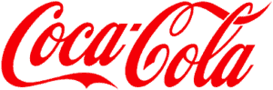
For sure, you have seen other logos copy this font style in order to capitalize on its ability to recall. However, the font style shall forever be associated with Coca Cola.
5. Simple Is Beautiful
When you are pushing the boundaries of creativity, you can easily get carried away with the bells and whistles. You tend to use all the tools at your disposal and run tests on how each design element works with another.
If you have too many components on your logo design, its message could get lost. Sometimes the best approach would be to pull back and utilize simple design. Many companies have adopted simple design for their logos and have carried it through the years with great success.
Nike, Coca Cola, and Apple are the obvious choices. Another good example is the logo of search engine giant, Google.

It has gone through changes over the years but the color scheme has remained the same. Most of the revisions on logo design have to do with its font styling. Today’s version uses a much simpler font style without the sharp edges and the shadowing.
6. The Psychology Of Shape
Earlier we discussed the psychology of color and how it can be used to influence the buying decisions of consumers. Another consumer theory that you should consider is the psychology of shape.
In the same way that colors and their various hues can trigger certain reactions or behaviors from consumers, round and angular shapes can also sway purchasing decisions to your favor:
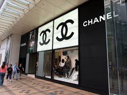
- Round Shape – Circles, curved lines, and ovals are used to convey femininity and emotion. Fashion brands such as Coco Chanel use round shapes in its logo design.
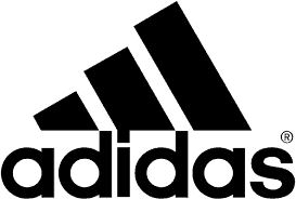
- Angular Shape – Squares and triangles are used to connote power, stability, and masculinity. A good example would be the Adidas logo.
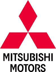
7. Consider Proportion And Symmetry
You don’t have to be a Graphic Designer to appreciate proportion and symmetry. They give your logo a clean, well-structured, and elegant look. Here are a few examples of logos that have great proportion and symmetry:
- YouTube

- Mitsubishi Motors
8. Share Your Story
Your logo is a way of communicating with your audience. It doesn’t need to have an image of your product to convey its message clearly. Some of the best, most iconic logos in business have a roundabout way of getting its message across to its target market.
Everyone knows the Starbucks logo.
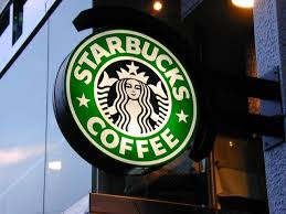
However, how many of you know why the company used the Siren as its logo?
The owners of Starbucks wanted a design with a nautical theme that best captured the spirit of Seattle. The original choice of the founders was “The Pequod” which was the name of the whaling ship in the classic piece of literature, “Moby Dick”.
Eventually, they thought against it because they thought it was open to mispronunciation and had poor recall. Instead, they went with the name of the Pequod’s first mate, “Starbucks”.
As for the Siren, in Greek Mythology, it was a creature that lured sailors to an island in the South Pacific. The use of the Siren is Starbucks’ roundabout way of luring you inside their store for a mug of freshly brewed coffee!
The entire process of coming up with a logo design may have been far-fetched, but the Starbucks logo is one of the most recognizable brands in the world.
Conclusion – Brand Building Takes Time And Effort
All of the logos we featured in this article took some time before they reached iconic status. As we mentioned earlier, logo design alone will not make your branding strategy a success. It must be supported by performance.
Remember that your brand is a promise to your customers. Therefore, you can view the logo as a way of keeping you accountable and focused on delivering that promise.
Do you need a logo for your business? Are you planning on changing your current logo design? If so, give us a call or drop us an email. Let’s sit down to have a quick chat to discuss what we can do to help you find a custom logo design that best represents your brand. Contact Us Today!