Once considered an “outdated” form of marketing, email continues to prove itself time and time again as an effective and reliable channel. Email marketing can help businesses acquire 40 times more customers than social media. A B2B audience, in particular, ranks email as the third most influential resource of information after thought leaders and colleague word-of-mouth.
This is why consistent investment into email content should be standard for a well-rounded digital marketing strategy. Newsletters are one of the simplest ways to keep your brand on subscribers’ radars and continuously build stronger engagement.
What constitutes a newsletter? A newsletter is an email sent (most likely at a regular schedule) informing subscribers of relevant business updates. Content varies from customer-focused information such as activity reminders or new product releases to business-focused brand news.
Here are five elements to pay attention to when constructing a perfect newsletter.
1. First Impressions
Due to the importance of high open rates, first impressions are extremely important in email marketing. Open rates are the percentage of emails opened in comparison to the total volume you’ve sent. It’s a standard benchmark to measure and it affects campaign performance—after all, subscribers who don’t open what you send can’t engage with the content in your newsletters.
This is why to hit or move beyond the average email open rate of 17.92%, you need to pay attention to:
- The email address you send campaigns from
Misrepresenting who you are by listing a vague email address risks having your mail sorted into the spam folder by email providers. This may be a violation of the FTC’s CAN-SPAM Act, which requires you to clearly state who you are in your emails.
- The text preview, or header and first few lines
Some browser extensions provide a snapshot preview of the contents of an email when they arrive. Take extra care in writing the first few lines or choosing the first image.
- The short phrase in your subject line
Subject lines are best kept short, clear, and inviting. The average recommended length is 35-50 characters—any more than this and email providers clip them short.
2. Copy
Which would you rather read from start to finish? A message that looks like it was copied and pasted and mass sent to everyone or something that uses your first name and looks crafted to appeal to your interests?
Personalization is the name of the game when it comes to the written content of your emails. 60% of marketers say data that provides contextual signals like location or weather is highly effective. Plus, personalization can improve conversion rates by 6%. Create different options for different customers, with newsletter content that varies according to the interests of each list segment.
In addition to the types of content you send, mind your writing style. Using online communication means you have to write for the web. That means:
- Shorter paragraphs and sentences
- Minimal jargon
- Focus on a single audience per newsletter
- Aim for a single goal to minimize distractions.
3. Layout
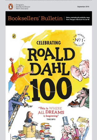
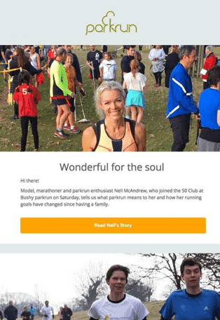
More than half of all emails are now opened on a mobile device, so the first thing to consider when laying out content is whether it’ll look good when read via smartphone. After that, you want to structure emails to present a natural flow of information, with images and text complementing each other to eventually lead towards a call-to-action.
Here are three email design layouts you can use.
- One column – A simple layout designed to work on both desktop and mobile, only coded to be mobile-first. They usually adapt and scale, and contain bite-sized information to help users navigate easier.
- Inverted pyramid – Begin with a large, engaging image. Follow it up with a value proposition that clearly communicates the benefits of reading, insert the rest of your content, and end with your CTA.
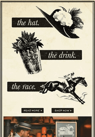
- Zigzag – An angular design grid using color-blocking and tilted imagery acts as a guide pushing the reader towards the end of the email.


Source: Campaign Monitor
4. Images
Go big or go home? It isn’t that simple. With changes in screen width, diversification of devices and resolutions, and consumer browsing habits, finding the ideal image size isn’t as straightforward as before. While desktop and laptop resolutions have become larger and sharper, more emails are being opened on smaller mobile devices. Responsiveness is key.
A safe size for your larger images, though? The best width for your newsletter images is still 600px wide, making the legacy of Microsoft Outlook live on. However, you can go wider if you keep central visual elements in the middle and use the rest of the space for the background instead.
When choosing content to accompany each part of your newsletter content, such as company updates or product recommendations, think of social proof and lifestyle. You want your audience to see themselves in your content, not alienate them. For example, if subscribers are older, you won’t want to use images with teenagers or a different age demographic.
5. Calls to Action
A good call to action button improves click-through rates and assists in conversions. And yes, they aren’t just links included within your email body, they’re individual buttons positioned right where your reader can see them.
Call to action buttons normally don’t have much variation, but there’s a good reason for that. These buttons are already an established bit of web design and automatically register in viewers’ minds as clickable, so deviating from that consistency will cause confusion. What you need to do is make sure the text on them is clear and actionable, that they’re visible on the page, and that they look inviting.
You can place them near the end of your newsletter or beside each segment of content referring to it, such as in the case of news collections and product catalogs. You need at least one—or else, why are you sending newsletters at all?
Final Thoughts
Newsletters are simpler in scope than emails built to support a special campaign. However, invest the right amount of thought into their design and you can build lasting relationships with your subscribers—eventually converting them into fully paying customers.
Author Bio
Ash Salleh is the Director of SEO at Campaign Monitor, where he works closely with content, copy, and analytics teams to improve site-wide optimization. Prior to his time at Campaign Monitor, he also provided SEO and digital marketing expertise at Zappos and Axiata Digital.


