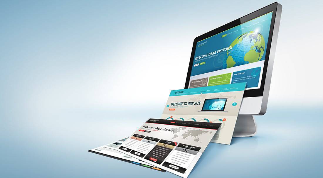
There are almost two billion websites on the Internet. If you see similarities between certain websites, it is because some use prepared template designs. These are downloadable website templates where the layout and structure have already been established.
Although this is a fast, easy, and convenient way to put up a website, it misses a very important element of effective design: Uniqueness.
The challenge for professional web designers is to conceptualize a design that is unique to its owner. Everything must come-together or align in website design. A business is an organization of people who share core values and a common vision to what the future may hold.
Design should embody; not distinguish the business and its owner. Its elements should represent the owner and support the purpose, objectives, message, and overall vision of the business.
Our Design Process At Mountaintop Web Design
At Mountaintop Web Design, we like to think of ourselves as artists and scientists. We explore the boundaries of creativity through artistic expression. However, at the same time, we respect the rules and precision of web design science. There are theories, guidelines, and principles of web design that we use as the basis for implementing artistic concepts.
We conduct research before initiating the formal design process. Research is categorized into two areas: empirical and intuitive.
Empirical Research
Under empirical research, we gather facts, relevant information, updated data, and other forms of usable and measurable inputs on the type of business and industry. We also implement best practices of web design which likewise, includes its own research. These principles go into each and every website we build.
Once we have a deeper understanding of the nature of the enterprise, we do a comparative analysis of the industry. This includes looking at the websites of the client’s closest competitors. We take note of design elements and similarities in content.
We also look through the competitors’ social media accounts. We want to see if there is alignment or some congruence between its design elements and those of the website.
Intuitive Research
Intuitive research is focused on the person behind the client. This is similar to a bank’s KYC or Know Your Customer approach. We want to know who the client is. What is his/her purpose? How did he/she get into this type of business? What are the motivating factors?
Our objective is to capture the essence of the client. His/ her personality should manifest on every page of the website. Its elements should reflect the client. When a visitor views the design and reads the content, he/she should have an accurate idea on who the business owner is.
Elements such as the use of color, spaces, angles, lines, and content will give site visitors clues on the type of person the owner is. Based on the interaction or response to the elements of design and content, the website visitor will rely on his/her intuition to formulate a profile on the business owner.
5 Popular Styles Of Web Design
There are many styles of web design. We would have to write an e-book to give you a complete rundown of every style that can be used for designing websites. Fortunately, we are not writing a textbook.
The purpose of writing this article is to give you an idea of how the design process works. It will give you a better understanding of what a professional web designer does and how to work with him/her when coming up with your own site.
In this section, we will discuss five of the most popular styles of web design. Then we will proceed to our own approach in designing websites for clients.
1. Illustrative Style
The Illustrative style of web design is highly visual in presentation. It uses drawing as the primary tool for design. We have graphic designers and artists who can come up with drawings or renditions based on an exchange of ideas with the business owner.
Renditions are visual expressions or concepts which the team believes best captures the message of the website. Creating design renditions for the Illustrative design is a close collaborative process with the client. We encourage the client to throw ideas on the design table.
As professional web designers, we incorporate principles of design to finalize the concept. Oftentimes, the client may have a different idea. Part of our job is to take the client through the design process so that he/she will get a better understanding of the principles of web design. This is how creative differences are resolved.
The final design is the one which the client feels accurately represents the business and at the same time stays within the parameters of effective web design techniques.
2. Single Page Style
The Single Page approach to web design is often confused with the Illustrative because it uses a rendition or depiction of a concept as the main design element. It can be colorful or simple. It could be vibrant or subdued.
Its overall purpose is to simplify web design. The structure is very simple and easy to navigate. You won’t find much text content on the Homepage as the focus remains on the image.
The Single Page style carries the same risk as the Illustrative in that the message of the design may not resonate with the site visitor right away. An image can look visually appealing but if used for symbolic purposes, its meaning may get lost in translation.
These styles of web design may work from an aesthetic standpoint. However, from a functional or messaging standpoint, the use of symbolic images may not deliver the desired results. That is why we do not actively recommend these styles to our clients.
We caution clients who prefer this style of design to exercise caution when it comes to the use of images as metaphors or symbolism. As much as possible, the design concept should provide visual signals that make it easier for site visitors to understand what the business is all about; who the owners are, what they do, their purpose and vision. The content should resonate immediately with the viewer.
3. Minimalist
Have you ever come across a website where the Homepage looks like an abstract painting? How about a website where it seems like you just landed on a maze? Outside of getting a migraine or feeling like a laboratory mouse, these designs have so much going on that its purpose and functionality are lost.
The Minimalist style removes all the clutter so all that remains are the essential elements, features, concepts, and forms. This type of design is very easy on the eyes. Good examples of the Minimalist style are websites that greatly use space. You see only black and white colors. Orientation is very clean and organized.
The Minimalist design is popular because it acts as a counterbalance to the chaos on the Internet. There is information overload; run a search query and you scroll through hundreds and thousands of websites. The Minimalist works because it focuses only on your central message.
4. Flat Web Design
If you’ve come across the Microsoft website, you’ll have a good idea of what Flat Web Design is. This style of web design combines minimalism with usability. It attempts to clear out unnecessary elements and just focus on items that greatly support usability and functionality.
Advocates of Flat Web Design typically use a combination of space with bright or dominant colors as defining areas of references. Overall design remains clean; the addition of colors with sharper hues creates better distinction among the other elements.
When we implement the Flat Web Design approach, we want the design to be prominent but not to the point that it detracts from the purpose of the website. Navigability should never be compromised.
5. Typographical
There is a good reason why recruiters generally reject resumes that are prepared using the Comic Sans font. You just won’t be taken seriously. Recruiters will always recommend Calibri, Cambria, Helvetica, and the over-used but still popular Arial.
The type of font you use is a design element that can successfully make or break your message. It triggers an emotional cue and an ensuing response. Used properly with image and text- based content, the typographical style can help you deliver a powerful and compelling story.
The drawback with the Typographic style is that it may slow down loading time. This is especially true when using mobile devices.
Mountaintop Web Design’s Approach To Web Design
Our underlying principle in web design is that best practices must always be implemented. Best practices in web design are those tried and true elements that have been proven to work. In this sense, we approach all of our clients in a similar same way. We can apply any style of web design that the client wants and which we feel strongly supports the purpose and objectives of the website.
However, our approach never veers off from the standard guidelines for effective web design:
- The website must be mobile-responsive. Design should be able to set up seamlessly and effortlessly on mobile devices regardless of screen size. It should be accessible by large groups of people.
- The website should have fast download speed. Our years of experience working with different clients and studying various industries have shown us that consumers are impatient. Our target is to make sure the client’s website can be accessed within 3 seconds.
- Design should be optimized. Even if you have the best images and text content, these would have little value to your website if they cannot be found. We implement the principles of SEO or Search Engine Optimization to make sure all images and text-based content can be easily searched, found, and indexed by web crawlers.
- Reliable security measures should be in place. We understand the value of a website for your business. Thus, we make sure all of our websites are built with the latest versions of the best security software. We also conduct regular site audits to run updates on plug-ins and address other issues that may present vulnerabilities to its security.
Case Study: Severe Weather Shelter
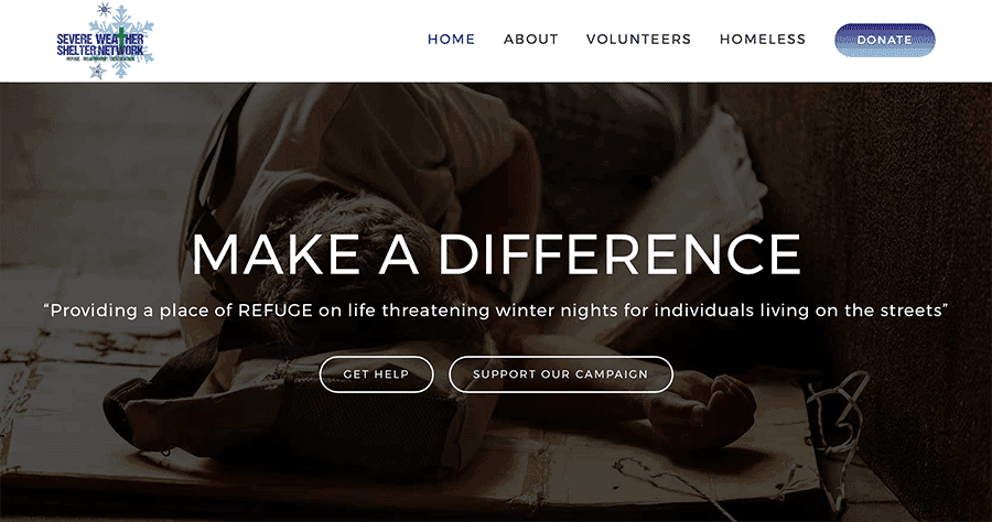
We designed this website for a non-profit ministry. The objective of our design approach was to strongly highlight the services of the ministry. This was effectively done through the use of relevant images, the organization of the site, and the layout which were proprietary to the ministry.
The overall effect of the design was to deliver a clear message that was powerful and urgent, yet sincere and simplistic in tone and content.
The design gives website visitors an accurate idea on who the ministry is, what they do, how they operate, and helps them gain a deeper understanding of their objective. As we mentioned earlier, website design must represent the purpose and vision of the business.
In this case, the purpose of the ministry is covered by the question , “Why did the ministry set up this organization?” The images, use of color, space, and layout, emphasize the ministry’s intent to help people in need.
We integrated the use of these provocative images with real statistics in order to compel the visitor into action. It certainly helped increase the number of donations and contributions to the ministry.
With the ideal design elements in place, our biggest challenge became the donation platform. We wanted to make sure it was easy and secure for people to use. Fortunately, we were able to implement the right platform for them and to date, the ministry continues to receive donations through its website.
If you are planning to have a website for your business or if you are thinking of having your current website re-designed, please feel free to give us a call or an email.


