In Part 2 of the series, we will focus on how to make your website design more relevant and useful to your audience. Effective website design isn’t just about aesthetics and functionality.
You want one that serves the interests of your audience. You want a website that will resonate with your visitors and make them feel comfortable – and confident – about patronizing your business.
1. The Website Is For Your Audience
We touched on this item briefly in the previous section. However, we feel this point must be addressed in detail because, in our experience, it has become a persistent problem for many clients.
We get it. The website is about your business and you, are your business. It will not do your business any good if the customer cannot see any value in it for him/her.
A person visits your website because he wants to see if you have the answers to his questions and or problems. If your content only shares information about:
- Your accomplishments in the industry.
- Your academic achievements.
- Your list of high-level clients.
- The awards you received as a professional,
- The citations your company received.
- Business and professional licenses and certifications.
These types of information are impressive and validate your qualifications – but do not provide the answers to the customer’s questions or problems.
The website is about your customer. It isn’t or shouldn’t be about you.
A case in point is the “About Us” page. Yes, the webpage is self-explanatory but writing strictly about you isn’t going to benefit the customer – or you.
Instead of writing about you, write about:
- The experiences that have given you a great understanding of what your customers go through.
- How your skills, knowledge, and experience can help your customers solve their problems.
- Your purpose – the “Why” of choosing this career and setting up this type of business.
Where your logo is located will give customers an idea if your website is about you or about them.
The most important location for your logo is the home page. If you wish, you can put it on the upper left corner of every page to maintain consistency in design. But if your logo is plastered everywhere – even in small areas on your sidebar – then it becomes like a nuisance ad to your customers.
Think about your experiences watching a compelling video on YouTube then the “Ad in 5 seconds” warning comes up.
How do you feel about the brand on the ad? Does it make you feel like patronizing the brand?
These ads can ruin the customer experience. It’s obviously an attempt by YouTube to sign up for a paid monthly subscription to its channel. Sign up or get annoyed by these ads while watching your videos.
YouTube can get away with it because it’s the biggest video streaming service on the Internet. If you have a small business website, you have to prioritize the customer experience by designing a website for them – not you.
2. Your Business Branding
Visuals are very important to your brand. Specifically, your logo. Not only must it be visually appealing but your logo must immediately communicate with your target audience what your business is all about.
Other than the design of your logo, here are 2 other visual elements that can support your business brand:
- Images – What are your images about? What message will they convey? Will you use stock images or original images?
The last thing you want is to put your audience into an art gallery and let them figure out what the images are about. You should choose images that support your UVP and are relevant to your business.
Using unique images is always a good idea. If you choose stock images, another website might have used them already. When it comes to Google’s search ranking algorithm, uniqueness always scores a lot of points.
- Colors – Psychologists have long theorized that colors affect consumer behavior. Many first impressions on a business are influenced by the establishment’s colors.
Whether you believe in psychology or not, why take chances? You can view it from a position of aesthetics.
If Psychology dictates Yellow is the best choice for your retail website, let the web designer come out with combinations that meet your satisfaction.
Lastly, your text content. Here are some simple guidelines to keep in mind about writing web copy:
- Include high-ranking, high-volume keywords in your web copy.
- Keep your webpage copy short and concise.
- Write in a conversational tone; avoid using technical jargon.
- Review your copy and make sure there are no spelling and grammatical errors.
3. The Design Layout
How would you feel if it took you an hour to find toilet paper in your neighborhood supermarket? Your website should be beautiful and functional – yes – and it should be navigable.
When a visitor lands on your website, he wants to know where to find what he’s looking for right away. If he can’t find the drop-down menu or if he gets confused about the content on the homepage, trust us, he will leave your website.
What makes for a good website design layout?
- Clean and simple layout; use a lot of space by incorporating white with the main colors of your website.
- Organize the webpage; make sure the CTA buttons and social media sharing icons are easy to find.
- Follow conventional reader orientation of moving from left to right.
- Limit the number of images and text content on the web pages.
4. The Website’s Calls-to-Action
What do you want your visitors to do when they land on your website? There must be a good reason or a singular purpose why someone would click on your URL.
Your Call-to-Action or CTA button summarizes the course of action that you want them to take:
- Buy Now
- Sign Up For Our Newsletter
- Click to Get Discounts
- Shop Now
- Become a Member Now
The CTA buttons must be definitive. They shouldn’t give the website visitor a moment to second-guess. The command must be clear and to the point – What do you want them to do?
Secondly, the CTA button must be easy to find and strategically located to support the course of action.
For example, a “Buy Now” CTA button could be located near a video explainer about your products and services. The social media sharing icons could be below the title of the blog or at the bottom of every web page.
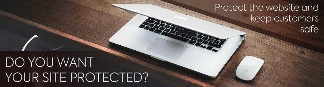
5. Website Security
Website security isn’t exactly a design element but if you can’t assure visitors that your site is safe, they might leave right away.
A potential client who clicks on your link and upon arriving at the homepage notices that the URL doesn’t have SSL certificates or the padlock symbol and is marked “Not Secure” might not do business with you.
SSL certificates encrypt all data that are transmitted from the webserver to the browser. This is especially important for e-commerce websites and other sites that require visitors to provide confidential information.
Having SSL certificates is a ranking factor for Google. In fact, the search engine giant requires ALL websites – not just e-commerce sites – to have SSL certificates.
6. Include Social Proof
Social proof is a testimony or review from a third party that your product or service is worth spending money on.
You can post testimonials from customers who love your products on the homepage as a vanishing slide or as static images. You can post 5-star reviews about your product below the UVP to give your brand a boost.
Presenting social proof can strongly influence consumer decision-making. It functions as an immediate validation of the quality of your product or service.
Conclusion
If the Internet is a shopping mall, the websites operating in it are the tenants. It’s not enough just to set one up for your business. To succeed, your website must be easily found and resonate with your target market.
An effective website is not just beautiful; it must be functional, navigable, and provide all the information a visitor needs. Every time a visitor lands on your website page, that becomes an opportunity to establish a relationship or generate revenue.
As a professional web designer, there are more than 10 things to consider but the ones listed in this article are enough to give you an idea of the process that goes into developing a website.
If you want to know more, give us a call or email. We’ll discuss how a website designed by Mountaintop Web Design can help take your business to the next level.
And if you enjoyed this article, feel free to share it with your community!