

With a website, you have the opportunity to reach out to a wider audience and offer them your products and services. A well-designed website can turn your vision into reality, improve business prospects, and enhance the online experience of your customers and followers.
However, a poorly designed one can do serious damage to your business. Here are some of the worst website design fails and how you can avoid them.
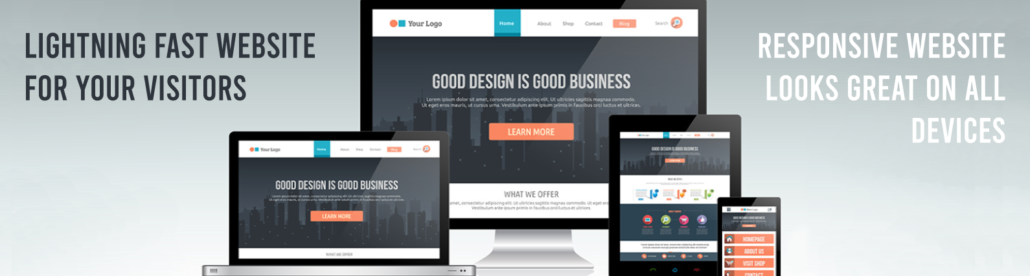
1. Design Is Not Mobile Friendly
If a user has to zoom in to read your content, he would rather click out and visit your competitor’s website.
According to a study conducted by Google, 72% of Internet users prefer to visit a website that’s mobile-friendly. In the same survey, 61% of respondents said they would abandon the search if the website is NOT mobile-friendly.
Put simply, a mobile-friendly website is one where the design is set up properly on a variety of devices regardless of screen size. Some features such as drop-down menus aren’t available because they’re hard to use on a mobile device but generally, the website is usable and convenient to use.
2. Weak CTAs
A Call-to-Action (CTA) is exactly what it means: What type of action do you want your website visitors to take? If your CTA comes across as weak, unsure, and indecisive, the website visitor will NOT take action.
We get it. You might be worried that the visitor might find you “overbearing”, “aggressive”, or “pushy”.
Here’s the thing: there’s a reason they clicked on your URL. Likewise, they’ll make a decision to stay or go within 7 seconds. You need a strong, beefed-up CTA to push the visitor in the direction you want them to go.
Here are 4 tips on how to come up with a strong CTA:
- Be clear and direct; what do you want them to do? “Buy Now!”, “Sign Up”, “Join Our Team”.
- Let the visitors know the CTA is clickable.
- Choose a color that’s eye-catching and enticing.
- The CTA button must be large enough to be easily seen.
How many CTAs can a website have? You can have multiple CTAs on your website and they’ll be effective as long as you follow the 4 tips we just discussed.
3. Prioritizing Form Over Function
We love it when our clients are excited about having their first website! Part of the Mountaintop Web Design process is to sit down with the client and listen to their ideas. Among the most popular design ideas we get from our clients are as follows:
- “Let’s set up an explainer video on the home page.”
- “I think a moving slide will look cool.”
These are all good ideas and will certainly present a new visual for visitors – but they can slow down your website and potentially distract them from your value proposition.
Instead of having an explainer video embedded on the home page, we suggest embedding a link to a video from the client’s YouTube channel.
By linking your YouTube channel, you don’t use up more server space and slow down your site. We can even create a “carousel” whereby the visitor can click a video from your library.
A moving slide will look cool but it can also distract the website visitor from your value proposition.
When a visitor lands on your home page, he’s immediately on search mode: “Why am I here?”. The visitor is looking for your value proposition – “What are you about?”, “How can you help me?”
From our experience, it’s always a good idea to keep everything static on your home page.
4. Poor Website Speed
In the previous section, we discussed how an embedded video can slow down your website. For Internet searchers, nothing is more frustrating than a website that takes forever to load. And on the Internet, forever means under 3 seconds.
What happens if your website doesn’t load fast enough? According to surveys, 40% of site visitors will click out if they can’t access the content in 3 seconds or less.
What factors could be slowing down your website loading time?
- Images aren’t optimized for size and format.
- The website has a lot of flash content which is good to make your site interactive but its files are too large.
- The website has too many ads. We’re sure many of our readers have experienced this with their favorite websites.
- Poor, unreliable web hosting service.
- Technical issues that are best handled by the developer such as unclean coding, not using enough caching techniques, and problems with Javascript.
You can easily run a speed test on your website. A good tool is Google’s PageSpeed Insights. It’s simple and easy to use and you get results right away. PageSpeed Insights will give recommendations but the best course of action is to talk to your web designer – or us!

5. Crowded Design
It’s 2:30 pm, you’ve just come out of a 4-hour meeting, missed lunch, and are really hungry. You head off to the nearest restaurant. The waiter hands you a one-page menu with 221 selections.
Now, you’re not sure if the migraine was triggered by hunger or the confusing menu.
The key to having a website that gets the job done is having one that gets the message across right away. You don’t have much time to hook the website visitor. If you have too many things happening on your web page, you’ll confuse your site visitors and ultimately, they’ll just leave.
- Design should drive the message or value proposition of your website.
- Keep it simple, not distracting.
- Make use of white spaces to give design elements more substance and depth.
Having all the bells and whistles doesn’t mean you’ll have a good, effective, result-producing website. In most cases, simple design does the trick.
6. Hard to Navigate
When you’re thinking about web design, you have to think like a site visitor. How would you want the experience to be? Of course, you would want to have everything laid out in a way that makes it easy to navigate around your website.
If your website is hard to navigate, your visitors will get frustrated and click out right away. Always keep in mind that people go to a website to fulfill a need. If they can’t find what they’re looking for in seconds, they’ll leave and click on another website.
Here are 3 tips on how to improve site navigation:
- Think of your website as a supermarket. How would you lay it out that customers – especially the new ones – can find the items they’re looking for? Your menu bar should be visible with the web pages properly described and organized.
- Each page should make it easy for the visitor to return to the home page. Some visitors might not be aware that they click on the logo to get back. If yours isn’t programmed this way, include a link that states “Back to Home”.
- Take the time to check the links and buttons on your web pages and make sure they work.
A website that is highly navigable will keep visitors coming back. You’ll have a better chance of getting leads.
7. Fonts Are Hard to Read
Font style is an important factor in web design. If the site visitor has a hard time reading your content, he’ll leave your website. Remember that most people will be accessing your website with a mobile device.
How do you choose the right font for your website?
- Style of Font – What’s your website about? Your style of font should fit the purpose of your website. Of course, you can’t go wrong with classic font styles such as Arial, Calibri, Helvetica, and Cambria.
- Size of the Font – Your text must be large enough to make it visible and not cause eye strain. Depending on the choice of font style, size 16 should be fine. The headings and subheadings must have slightly larger font sizes.
- Font Color – Headings and subheadings have to be bold-faced but the rest of the text must still be readable. We’ve come across web pages whereby the text for the main body is almost grey which makes it hard to read.
You can use more than one font style but don’t exceed three types of font.
8. Poor Color Choices
Your choice of color is just as important as your choice of font styling although for a different reason. If your choice of font style impacts user experience, your choice of color influences the identity of your brand.
How do you choose the right color or colors for your website?
- Consult the Color Wheel – Psychologists believe colors have a way of influencing a person’s behavior and ability to make decisions. For example, the color Yellow supposedly encourages people to buy. The Color Wheel is an illustration that depicts the relationship between different colors and their various hues.
Whether there’s truth to the Color Theory, choose colors that are associated with your industry or type of business. If you’re in Information Technology, blue is ideal for you. In contrast, those in the food business might be better off with orange or red.
- Refer to Your Brand or Logo – What are the colors used in your business logo? It would be a good idea to carry those colors over to your website for consistency in branding.
We suggest choosing no more than 2 colors for your website. As we briefly touched on in #5 “Crowded Design”, make use of white spaces to add more depth and substance to the page’s design elements.
9. Text-Heavy Pages
Would you explore a website where the pages feature wall-to-wall text? People go to websites to read the content but again, the text must be easy to read.
If you notice in this article, the paragraphs are limited to no more than 3 sentences and hardly exceed 4 lines of text. We did this to use white spaces to make each paragraph more readable and easy to scroll down on a mobile device.
Also, we want to break up each paragraph according to the main idea to maintain better continuity of the article’s context.
Lastly, we recommend using more images than text on your pages because people tend to respond better to visuals.
10. No SSL Certificates
We saved the best for last.
People are wary of visiting websites that don’t have SSL certificates. According to a survey, 92.3% of browsing time is spent on websites that are covered by SSL Certificates.
SSL stands for Secure Sockets Layer. This is an encryption program that protects data from getting stolen when it’s transmitted from browser to server. It used to be the case that only eCommerce websites were required to have SSL certificates.
Google has expanded SSL coverage as a must for all types of websites. Failure to do so will result in the dreaded “Not Secure” or slashed padlock icon branding from the Internet’s biggest search engine.
If your website isn’t covered by SSL Certificates – get them now. That’s our CTA for you! They’re inexpensive, can boost your branding, and are easy to install. We can do this for you in no time at all.
Conclusion
The good thing about having a website is that it’s easy to redesign. And depending on the extent of the redesign, it might not cost much. For sure, redesigning a website is more affordable than redesigning a brick-and-mortar store.
If your website isn’t achieving its goals, a redesign might be in order. As you have read in this article, even the smallest oversights in design can have major repercussions on your website’s ability to deliver results.
Give us a call or an email if you’re thinking about having your website redesigned. We’ll do a quick audit and present our findings and recommendations to you. Since you’ve already invested in a website, we suggest that we move forward to make sure it pays out dividends.
Did you find this article helpful? If so, feel free to share it with your community.