

Informational websites exist primarily to communicate with visitors, as opposed to actively enabling transactions. While the material they provide often contains some call to action, their main goal is to provide useful, engaging information.
Let’s assume you’ve got the content side of this covered. Your writers are producing good quality information that speaks to the needs of your target audience. Great job – you’ve got the hardest part of this process sorted.
Let’s also assume your marketing efforts are paying off and you’re generating an impressive amount of traffic to your homepage. Awesome! You’re killing it!
Yet, somehow, your home page’s bounce rate is still depressingly high. Despite all the visitors it attracts, you’re simply not seeing enough of them click through to the content you’ve worked so hard on creating.
Your homepage is frequently the first and only chance you get to make a first impression, and we all know how important that is. It’s possible that you’re simply not using it well enough to generate interest in what you’re offering.
Let’s take a look at how you can improve the design of your site’s most important asset to promote better engagement.
1. Don’t Hide What You’re Offering
Too often, the actual purpose of websites is obscured amidst needless information and UX clutter. A website isn’t a box of chocolates; visitors need to know what they’re gonna get – preferably within seconds of landing on it.
A terrific example of a site getting this right is The Adventure Junkies. The oversized hero banner conveys the tone of the site beautifully, allowing an instant emotional connection with their target market. The image is muted and slightly desaturated, which makes reading the main tagline very easy. Images like this are often unfair competition for the UI elements you want the visitor to connect with, and this designer employed a smart design technique to circumvent this problem.
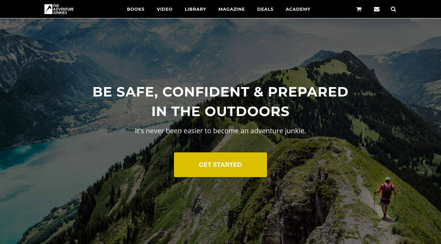
Source: theadventurejunkies.com
As a user scrolls down the page, they see additional information in concise statements with simple, obvious headlines. Each of the site’s informational “sections” is given this treatment. There are no walls of text, only simple, engaging, unpretentious statements of what the user can expect on the site.
2. Give Your Best Content Top Billing
Real estate on your homepage is extremely valuable. There are certain UI elements that simply have to be instantly visible. Just like your hero banner and your site’s tagline, navigation should be prioritized and easily accessible.
Certain information websites, like Not a Travel Club, opt to dedicate a sizable chunk of their primary real estate to whatever is their current top story. In fact, their featured post, along with its header image and content extract, takes up the majority of the screen below the navigation bar.
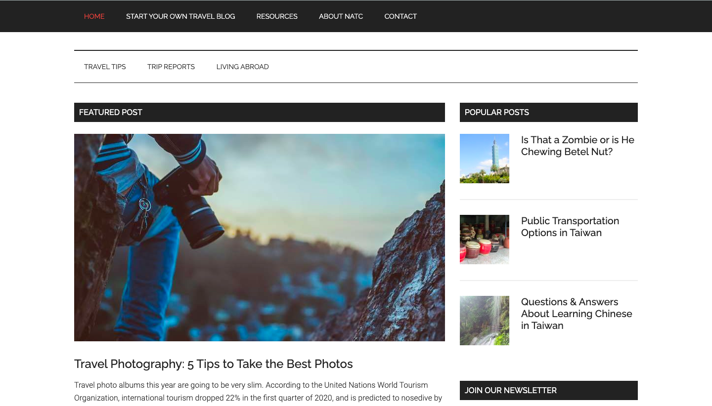
Source: notatravelclub.com
This is an excellent use of space for an information website. Direct your audience’s focus to a certain element by giving it extreme visibility in relation to the rest of the content on your homepage.
3. Categorize Content Smartly
If your information website consists of a very large inventory of content, you’ll want to make sure that your categorization is done intelligently. Many sites opt for a non-hierarchical approach here, allowing visitors to navigate content categories using tags.
Having a massive amount of content could also be one of your site’s main selling points. In this case, consider making the act of browsing the primary focus of the homepage.
A site that leads with this UI approach on their homepage is Ted Talks. Firstly, the type of content that users can expect is conveyed visually with two perfectly blended images of speakers doing what they do. Floating above this visual is a category-browsing element that could very easily have been confusing to understand if it had been overthought.
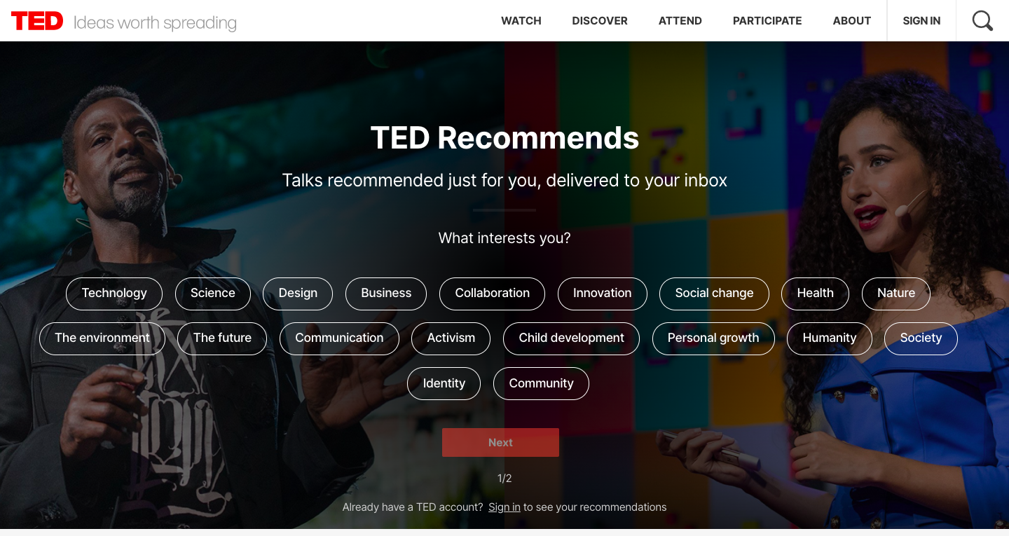
Source: ted.com
Ted keeps things simple by just asking visitors what they’re interested in, giving them category options, and keeping the user’s flow towards the content obvious with a button simply labeled “Next.”
4. Make it Responsive
A responsive website is one that automatically adjusts its layout based on the device the visitor is viewing it on. Smart web designers create different versions of their homepage, each customized to fit perfectly on whatever size screen it’s being deployed to.
The objective of responsiveness is to ensure a comfortable experience for your visitors. If they are viewing your homepage’s desktop version on an iPhone, they would have to waste their time zooming and scrolling, rather than clicking (or tapping) on an easily visible link.
Making a site responsive is quite an undertaking, but the ubiquity of mobile devices absolutely demands it. If you’re not offering your visitors an experience that’s been tailored for their browsing device, you are severely compromising the likelihood of them browsing the content you have on offer.
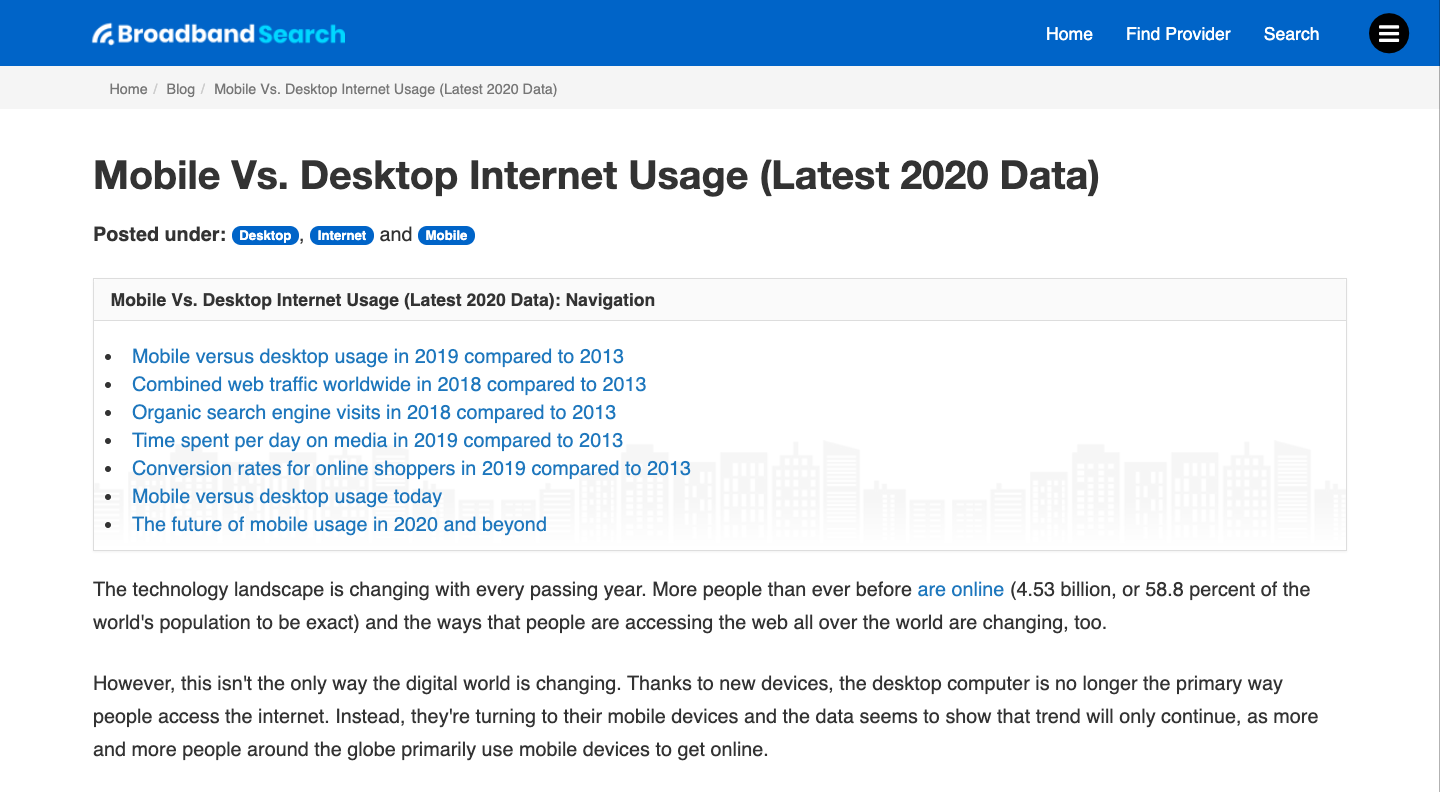
Source: broadbandsearch.net
Fortunately, many content management systems, like WordPress, offer website templates that are already fully responsive. Site-building products like Squarespace offer templates with similar behavior. If you’re still in the process of designing your website, or you’re looking to overhaul it, consider opting for a template offering this critical feature.
5. Use Video Wisely
If your goal is to grab visitors’ attention immediately, consider standing out from the crowd by using video content in your homepage’s header. Seeing beautifully produced, highly relevant “moving pictures” is something that’s been proven to drive greater engagement.
What’s critical, though, is that the video’s load-time doesn’t compromise the user’s experience on the site. Few things contribute to a high bounce rate as much as the frustration of waiting for content to load. Sadly, high-resolution videos can play a big part in delaying a fully-loaded screen.
A site that uses this technique very wisely is publishing giant Conde Nast. Their homepage’s above-the-fold real estate is populated entirely with a video element that advertises their inventory of brands in a very attractive way.

Source: condenast.com
Underneath the video, the homepage features three sections of text on their brands, working at Conde Nast, and the places where the company operates. There’s a prominent CTA button accompanying each section and enticing the reader to explore further. To reduce the impact on their site’s load time and make sure there’s no visual clutter, Conde Nast has limited the rest of the homepage’s visual content, displaying four high-quality images in a simple and neat layout.
One thing you want to be careful with is that video, no matter how high-quality, shouldn’t entirely replace written content. Search engines look for text as part of their indexing process, so make sure your homepage features informative, engaging, and well-written content that will help both the reader and Google get a good idea of what your site is about.
Some Final Words
The importance of designing an engaging homepage can’t be overstated. As in real life, you have one opportunity to make a great first impression with your website. If you’re trying to promote further engagement with your site’s content, you must respect your audience’s time and attention.
If you have this in the forefront of your mind as you design your website, you’re certain to create the user experience that your content deserves.